Tag: scraper

Inordinately fond of bottles…

J.B.S. Haldane, when asked “What has the study of biology taught you about the Creator, Dr. Haldane?”, he replied:
“I’m not sure, but He seems to be inordinately fond of beetles.”

The National Museum of Science & Industry (NMSI) has recently released a catalogue of its collection in easily readable form, you can get it here. The data includes descriptions, types of object, date made, materials, sizes, and place made – although not all objects have data for all these items. Their intention was to give people an opportunity to use the data, now who would do such a thing?

The data comes in four 16mb CSV files plus a couple of other smaller ones covering the media library (pictures) and a small “events” library. I’ve focussed on the main catalogue. You can load these files individually into Microsoft Excel, each one has about 65536 rows so they’re a bit of a pain to use, alternatively you can upload them to a SQL database. This turns out to be exceedingly whizzy! I wrote a few blog posts about SQL a while back as I learnt about it and this is my first serious attempt to use it. Essentially SQL allows you to ask nearly human language looking questions of big datasets, like this:

USE sciencemuseum;
SELECT collection,
COUNT(collection)
FROM   sciencemuseum.objects
GROUP  BY collection
ORDER  BY COUNT(collection) DESC
LIMIT  0, 11000; 

This gets you a list of all the collections inside the Science Museums catalogue (there are 162) and tells you how many objects are in each of these collections. Collections have names like “SRM – Acoustics” and “NRM – Railway Timepieces”, the NMSI incorporates the National Railway Museum (NRM), and the National Media Museum (NMEM) as well as the Science Museum (SCM) – hence the first three letters of the collection name. I took the collection data and fed it into Many Eyes to make a bubble chart:
The size of the bubble shows you how many objects are in a particular collection, you can see a majority of the major collections are medical related. So what’s in these collections? As well as longer descriptions, many objects are classified into a more limited number of types. This bubble chart shows the number of objects of each type:

This is where we learn that the Science Museum is inordinately fond of bottles (or jars, or specimen jars, or albarello’s or “shop rounds”). There are also a lot of prints and posters, from the National Railway Museum. This highlights a limitation to this type of approach: the fact that there are many of an object tells you little. It perhaps tells you how pervasive medicine has been in science – it is the visible face of science and has been for many years.

I have also plotted when the objects in the collection were made:

This turns out to be slightly tricky since over the years different curators have had different ideas about how *exactly* to describe the date when an object was made. Unsurprisingly in the 19th century they probably didn’t consider that a computer would be able to process 200,000 records in 1/4 second but simultaneously be unable to understand that circa 1680, c. 1680, c1680, ca 1680 and ca. 1680 actually all mean the same thing. This shows a number of objects in the first few centuries AD, followed by a long break and gradual rise after 1600 – the period of the Scientific Revolution. The pace picks up once again at the beginning of the 19th century.

I also made a crack at plotting where all the objects originating in the UK came from, on PC this is a live Google Map and is zoomable, beneath the red bubbles are disks sized in proportion to the number of objects from that location:

From this I learnt that there was a Pilkingtons factory in St Asaph, and a man in Chirk made railway models. To me this is the value of programming, the compilers of the catalogue made decisions as to what they included but once in my hands I can look into the catalogue according to my interests. I can explore in my own way, if I were a better programmer I could perhaps present you with a slick interface to do the same.

Finally for this post, I tried to plot when the objects arrived at the museum, this was a bit tricky: for about 60% of the objects the object reference number for objects contains the year as the first four characters so I just have the data for these:

The Science Museum started in 1857, the enormous spike in 1889 is due to the acquisition of the collection of Sir John Percy on his death, I discovered this on the the Science Museum website. Actually, I’d like to commend the whole Science Museum site to you, it’s very nice.

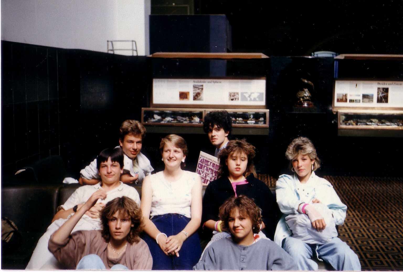
I visited the Science Museum a number of times in my childhood, I must admit to preferring it to the Natural History Museum, which seemed to be overwhelming large. The only record I have of these visits is this picture of a German Exchange visit to the museum, in 1985:

I must admit to not being a big fan of museums and galleries, they make my feet ache and I can’t find what I’m looking for or I don’t know what I’m looking for, and there never seems to be enough information on the things I’m looking at. This adventure into the data is my way of visiting a museum, I think I’ll spend a bit more time in wandering around the museum.

I had an alternative title for people who had never heard of J.B.S. Haldane: “It’s full of jars”

Footnote
If the Many Eyes visualisation above don’t work, you can see them in different formats from my profile page.

That’s nice, dear

This blog post is about programming, for people that don’t program – at least that’s the effect I’m aiming for. The title is in recognition of my tolerant wife, The Inelegant Gardener, who has learnt the appropriate response to my enthusiastic displays of the results of my programming: “That’s nice, dear”!.

I started programming a long time ago – in around 1980, at the school computer club, when I was 10. Since then I’ve been taught odd bits of programming by scientists, and done quite a lot of programming as part of my scientific job. I’ve started to get more interested in proper software engineering in the last few years. This is a roundabout way of saying I am an enthusiastic amateur.

People associate programming with the mathematically minded, but this isn’t necessarily the case: the codebreakers at Bletchley Park, who were amongst the first users of electronic computers, had a range of skills – amongst them were linguists and crossword wizards. I was talking to a Fellow in linguistics, who’d helped write his college’s library software – as he pointed out: a very logical view of language is a great benefit for a programmer. Programming is about giving an idiot very exact instructions, if the instructions concern maths then you need to know maths – otherwise you don’t.

The core of programming is still what I learned years ago, data (numbers or letters) is stored in “variables” that have names. There are conditional statements: “If [something is true] Then [do this] or else [do the other]”. There are looping statements: “Do this 100 times”. And there are functions: “add 2 to this number, square it, add the number you first thought of and tell me the answer” or “how many times does the letter a occur in this sentence”.

These simple statements are being buried under an increasing depth of additional ideas. Since the 80’s the big thing in programming has been “object-orientation”. In object-orientated programming you package up data of a particular sort with functions that relate to that data. So if you had data modelling an octopus you would include functions such as “wave-tentacles” and “change colour”, such functions would be useless for data describing a horse. The real benefit to this is comprehending larger software systems, because a sea of functions and data is grouped together into logical islands. Beyond this there are design patterns – reoccurring systems of objects which I haven’t entirely go the hang of.

In addition to the changes in language, there are changes in the tools used to program: syntax highlighting is nice, it amounts to colouring the verbs, nouns and proper names in programming in different colours – makes it easier to spot mistakes. Auto-completion is another handy tool, in a well-designed language there are only a limited number of next possible statements when you are programming – auto-completion presents you with them as you type. Sites like Stackoverflow are great for asking programming questions, and there no end of function libraries available on the web to help you out.

I have a number of little software projects on the go, you can see them in much the same way as woodworking projects, suduko or crosswords: they keep me out the way, muttering quietly to myself and exercising my brain. It doesn’t matter that what I’m doing isn’t groundbreaking and new.

Programming does lead to some odd habits; when I started programming it was useful to know binary and hexadecimal number systems, as a consequence I believe that numbers such as 1024 and 128 are nice and round. I’ve come to appreciate a wide range of bracket styles [] (){} since they are all used for different things and the semi-colon is one of the most important pieces of punctuation in my life. If I program for too long in a stretch I start to forget how to speak to people.

And just to show off the results of my latest fiddlings: maps of the UK election results. I got interested in doing this just after the General Election. The Guardian has published a lovely spreadsheet of election results, including data on every single candidate. You see lots of maps of data of this sort, I wanted to know how it was done. (Technical details beyond the maps.)

First of all the gender of MP’s by constituency: constituencies represented by ladies are marked pink, those by men marked blue:

The black constituency in northern England is Thirsk and Malton, which held its election on 27th May, following the death of one of the candidates during the general election campaign.
The population of each constituency is also interesting, here I have coloured the constituencies with 9 different shades of green, the palest shade corresponds to a voting population of between 20,000 and 30,000, the darkest shade corresponds to a population of between 100,000 and 110,000:
The Western Isles (now known by it’s Gaelic name: Na h-Eileanan an Iar) has the smallest population at about 22,000 and the Isle of Wight has the largest population with just under 110,000 potential voters. I used ColorBrewer to find a nice set of colours.
Finally here’s a map of which party came second in each constituency in the 2010 General Election:
Red for Labour, blue for the Conservatives, orange for Liberal Democrats, yellow for Scottish Nationalists, pale green for Plaid Cymru, dark green for Sinn Fein, blue for Ulster Conservatives and Unionists, and there are a few independents and minor Northern Island parties which are all coloured white.

Footnotes

So the task is to get the spreadsheet data into a map: To get started I did a bit of memory trawling and googling, a couple of people have written about colouring in maps: this one uses shapefile format map data and the R programming language, whilst this one uses SVG format map data and Python (another programming language). It turns out the shapefile format data for constituencies is a little difficult to get – you have to fill in forms! However enterprising people on Wikipedia have made SVG format constituency maps available. SVG stands for Scaleable Vector Graphics, it’s an XML format which means it’s plaintext and there are standard means to extract data from it and manipulate it. The only real problem is that the constituency names in the spreadsheet don’t exactly match the names inside the SVG format map – I had to resort to some horrible constituency by constituency coding for a load of them. To do this I used the C# programming language, largely because Visual Studio Express C# is a very nice, free development environment which I’ve used before. To view the SVG maps inside my application I used the Webkit .NET library to provide a webbrowser control (which wraps up the rendering engine used in the Safari and Google Chrome browsers) – the native C# webbrowser control is based on Internet Explorer – which doesn’t render SVG. Output to bitmaps is a bit clumsy, Inkscape (a free SVG editor) wasn’t keen on displaying the original constituency map, so I resorted to viewing the map in Google Chrome and taking a screen shot (a terrible bodge).

The Royal Society and the data monkey

This year finds the Royal Society celebrating its 350th anniversary. The Royal Society is Britain’s national academy of science, one of the first of such societies to be founded in Europe. My brief investigations suggest that only the Italian Accademia dei Linceis and the German Academy of Sciences are older, and then only by a relatively small margin. The goals of the Royal Society were to report on the experiments of its members and communicate with like-minded fellows across Europe.

The Gentleman Administrator is planning some historical blogging on the Royal Society this year, starting with this post on the founding of the society and the role that Charles II played in it. On the face of it this post is about the history of the Royal Society, but in truth it says more about me as a data monkey than it does about the Royal Society. I shall explain.

The Royal Society supply a list of previous members as a pair of PDF format files, these contain each fellow of the Royal Society with their election date, their membership type and, for some, the dates of their birth and death. The PDF is formatted in a standard way suggesting to me that it could be read by a computer and the data therein analysed. I suspect there is an easier way to do this: ask the Royal Society whether they can supply the data in a form more amenable to analysis such as a spreadsheet or a database. But where’s the fun in that?

As an experimental physicist, getting data in various formats into computer programs for further analysis is what I do. This arises when I want to apply an analysis to data beyond that which the manufacturer of the appropriate instrument supplies in their own software, when I get data from custom-built equipment, when I trawl up data from other sources. I received a polite “cease and desist” message at work after I successfully worked out how to extract the text of internal reports from the reports database, they shouldn’t have said it couldn’t be done! I will save you the gory details of exactly how I’ve gone about extracting the data from the Royal Society lists, suffice to say I enjoyed it.

First up, we can identify the Presidents of the Royal Society, and their terms of office from the PDF files – this information is in the name entry for each of them. We can look this data up too). I’ve plotted these below in a manner reminiscent of the displays of the earth’s magnetic field reversal, each coloured stripe represents a presidency, and the colours alternate for clarity. The width of the stripe shows you how long each was president:

In the earlier years of the Royal Society’s history the Presidential term varied quite considerably: Sir Isaac Newton served for 24 years (1703-1727), and Sir Joseph Banks for 42 years (1778-1820). Since 1870 the period of the office seems to have been fixed at 5 years.

Next, we can work out the size of the fellowship in any particular year, basically we go through each fellow in the membership list and see when they were elected to the society and when they died: between these two years they were members. These data are plotted below:

We can see that membership in the early years of the 19th century started to rise significantly but then after 1850 it started to fall again.

This fits in with historical records, in the earlier years of the 19th century some younger fellows pointed out that the Royal Society was starting to turn into a fancy dining club and that most of the fellows had published very little, in particular Charles Babbage published Reflections on the decline of Science in England, and on some of its causes. Wheels ground slowly but finally, in 1846, a committee was set up to consider the charter of Society and how to curb its ever growing membership. I’ve not found the date on which the committee reported but subsequent to this date, admission to the society was much more strictly controlled. Election to the Royal Society is still a mark of a scientist a little above the ordinary.

The data on birth and death dates starts getting sparse after about 1950, presumably since many of the fellows are still alive and were reluctant to reveal their ages. Doing analysis like this starts to reveal the odd glitch in the data. For example,Christfried Kirch appears to have died two years before being elected. At the moment I’m not handling uncertainty in dates very well, and I learnt that the letters “fl” before a date range indicate that and individual “flourished” in that period, which is nice.

If anyone is interested in further data in this area, then please let me know in the comments below. I intend adding further data to the set (i.e. hunting down birth and death dates) and if there is an analysis you think might be useful then I’m willing to give it a try. I’ve uploaded the basic data to Google Docs.

Footnote
The illustration at the top of this piece is from the frontspiece of William Sprat’s The History of the Royal Society of London, for the Improving of Natural Knowledge, published in 1722.