Tag: maps

Book review: Measure of the Earth by Larrie D. Ferreiro

Measure-of-the-EarthThis post is a review and summary of Larrie D. Ferreiro’s book “Measure of the Earth” which describes the French Geodesic Mission to South America to measure the length of a degree of latitude at the equator. The action takes place in the 2nd quarter of the 18th century, the Mission left France in 1735 with the first of its members returning to Europe in 1744.

The book fits together with The Measure of All Things by Ken Alder, which is about the later French effort to measure a meridian through Paris at the turn of the Revolution in order to define the metre, The Great Arc by John Keay on the survey of India and Map of a Nation by Rachel Hewitt on the triangulation survey of the United Kingdom.

The significance of the measurement was that earlier triangulation surveys of France had indicated that the earth was not spherical, as had pendulum measurements made by Jean Richer in Guyana in 1671 which showed a pendulum there ran 2:28 slower there than in Paris. A Newtonian faction believed that the earth was flattened at the poles, its rotation having led to a bulging at the equator. A Cartesian school held that the earth was flattened around the equator and bulged at the poles, this was not a direct result of work by Rene Descartes but seems to have been more a result of scientific nationalism. Spoiler: the earth is flattened at the poles.

From a practical point of view a non-spherical earth has implications for navigation – ultimately it was found that polar flattening would lead to a navigational error of approximately 20 miles in a trans-Atlantic crossing although at the time of the Mission it was believed it could have been as much as 300 miles. Politically the Mission provided an opportunity for the French to form an alliance with the Spanish, and to get a close look at the Spanish colonies in South America which had provided huge wealth to Spain over the preceding 200 years. Ferreiro provides a nice overview of the L’Académie des Sciences under whose aegis the mission was conducted,and of the Comte de Maurepas, French minister of the navy and sponsor of the Mission.

The core members of the Geodesic Mission were Pierre Bouguer, Charles-Marie de La Condamine, and Louis Godin they were accompanied by Spanish Naval cadets Antonio de Ulloa y de la Torre-Guiral  and Jorge Juan y Santacilia. Other members were Joseph de Jussieu (doctor and botanist), Jean-Joseph Verguin (engineer and cartographer), Jean-Louis de Morainville (draftsman and artist), Theodore Hugo (instrument maker), Jean-Baptiste Godin des Odonais and Jacques Couplet-Viguier.

Louis Godin, an astronomer, was the senior academician and nominal leader of the mission. Pierre Bouguer, was a mathematician, astronomer and latterly geophysicist: as well as the measurement of the degree of latitude he also attempted to measure the deflection of a plumb-line by the mass of a mountain – an experiment which Nevile Maskelyne was to conclude successfully in 1775, I wrote about this here. Bouguer also wrote a treatise on ship building whilst away in South America. Charles-Marie de La Condamine could best be described as an adventurer although he was also a competent mathematician and geographer, it was his more lively writing on life in South America which would have a bigger impact on their return to Europe.

The scheme for the determination of the length of a degree is to measure the length of a meridian (a line of longitude) close to the equator by triangulation, making a ground measurement baseline to convert the angular measurements of the triangulation survey into distances and a second baseline to confirm your workings; the latitudes of the ends of the triangulation survey are determined astronomically by measuring the positions of stars. I’ve read of this process before, the new thing I learnt was the method for aligning up your zenith sector with the meridian – which I’m tempted to try at home.

These measurements were done in the area around Quito, in modern Ecuador (named after the equator), the endpoints of the survey were at Quito in the north, close to the equator and Cuenca approximately 200 miles south. During the survey, through the Andes, the team scaled peaks as high as Mont Blanc (and suffered altitude sickness for their troubles) which would not be climbed for another 50 years. The survey was repeated in the early years of the 20th century and even then it took 7 years – the same length of time as the original survey, due to the transport difficulties presented by the terrain.

The work of measuring the meridian was made more difficult by the journey to get there (which took the best part of a year), the terrain and conditions when they got there (mountainous and cloudy), the poor leadership of Godin, local political machinations and the mother country cutting them loose financially. Ferreiro makes a lot of Godin’s poor leadership, some of which is justified – he spent Mission money on prostitutes and regarded the Mission funds as his own purse. Frequently the Mission split into two groups, one containing Bouguer and La Condamine and the other Godin – sometimes this is quite appropriate, in duplicating measurements for consistency whilst on other occasions it is simply fractiousness.

To a degree the Mission was scooped by measurements made above the Arctic Circle in Lapland, this mission was also promoted by the L’Académie des Sciences, led by Pierre Maupertuis (a rival of Bouguer) and Anders Celsius. It completed its work in 6 months, well before the Geodesic Mission had finished their work, discovering that the poles of the earth were flattened. However, doubts remained over the results and the full determination required the data from the equator. Bouguer presented this on his return to France, to great acclaim, showing that the earth was flattened by 1 part in 179 (later measurements showed that the flattening is actually smaller at 1 part in 298).

The Mission spawned a wide range of publications by its members, covering not only the geodesic component of the work but also regarding life and nature in South America. Ferreiro credits La Condamine’s work in particular has setting the context of how South America was viewed for quite some time after the mission. The Spanish officers also made in impact an highlighting colonial misrule back to their home country. Arguably the international collaborative elements of the Mission set the scene for the measurements of the transit of Venus later in the 18th century.

Ferreiro makes a comparison between the French Geodesic Mission, which was centrally run by the state and the British Longitude Prize, which although state funded was privately executed, implying that the former was superior. It’s not clear to me whether he’s engaging in a degree of hyperbole here, since the Mission was to some degree an organisational car-crash and was in large part funded from La Condamine’s own purse at the time. Furthermore, L’Académie des Sciences also awarded prizes – having copied the British government in this and the Royal Society was from the outset a very internationally oriented organisation. So the picture as Ferreiro presents it is something of an over-simplification.

I found the book very readable, its clearly based on a large quantity of primary source material and covers a great deal beyond the simple mechanics of the Geodesic measurements.

Footnotes

My Evernotes on the book are here.

Book Review: The Great Arc by John Keay

TheGreatArcThis is a review of “The Great Arc: The Dramatic Tale of How India Was Mapped and Everest Was Named” by John Keay. This book does exactly what it says in the lengthy subtitle: describe the Great Triangulation Survey of India which was conducted in the first half of the 19th century.

It fits together with “Map of a Nation” by Rachel Hewitt and “The Measure of All Things” By Ken Alder. The former describes the detailed mapping of the United Kingdom by the Ordnance Survey, whilst the later describes the measurement of the Paris meridian by Méchain and Delambre. Of the three surveys the French one had been completed first at the beginning of the 19th century whilst the mapping of the UK was going on at the same time as the Indian survey.

The book is centred around the Great Arc survey originally proposed by William Lambton at the beginning of the 19th Century. Lambton’s aim was primarily to measure a meridian (a line of longitude), in the same manner as the Paris meridian in order to gain more information on the shape of the earth (geodesy). For his sponsors in England and the administration of India the survey served as a military and commercial exercise. Military action is often a spur to survey, since getting your troops and their equipment from point A to point B and ensuring they prevail over any forces they come across on the way is a high-value activity which is greatly assisted by the provision of accurate maps. Surveying is also invaluable when you are planning infrastructure such as roads, canals and railways.

The survey came a time when the British relationship with the area now known as India was changing from a trading one based on outposts to one in which the British took territory militarily. The Triangulation Survey was not exhaustive, it comprised a central spine (The Great Arc) running along the 78th meridian up through the tip of the Indian peninsular to the edge of the Himalayas with regular “cross-bars” running from West to East, towards the north an array of parallel meridians were also measure. (You can see a map here). The aim was to use this survey to constrain further local surveys.

The Great Arc survey was a great endeavour, taking 40 or so years in total, after Lambton died in 1823 George Everest took on the job of leading the project. Lambton seems to have been a pleasant sort of chap who went a little native, disappearing from the view of his sponsors. Everest, on the other hand, appeared to be a complete git – being abusive to most of his subordinates and apparently also winding up his superiors.

Much of the activity in the book is in common with that which took place during the surveys of France and the United Kingdom. Laying out base-lines: distances measured directly on the ground by means of rods or chains used to pin down the distances in the “triangulation” which is a collection of angular measurements at the vertices of an array of triangles. Once again the precision is impressive, two 7 mile baselines measured out 200 miles apart agree with the triangulation measurement to within a few inches. Angular measurements were made using a theodolite, Keay labels the one used in India as the “Great Theodolite”, which I thought was a term reserved for the Ramsden device used in the UK (we can’t all have a Great Theodolite!).

The Indian survey presented different challenges in the form of the wildlife (tigers, scorpions etc) but also disease. The rate of attrition amongst the surveyors, particularly as they traversed jungle was terrible. The book is not explicit about figures but in the later stages of the survey something like a thousand men were involved and a couple of hundred of those died of disease. Lambton and later Everest both suffered from recurring bouts of malaria.

The “discovery” of Mount Everest and the tallest peaks in the Himalayas was somewhat incidental to the main thrust of the survey. It had become clear in the first decade or so of the 19th century that the Himalayas were the tallest mountains in the world but their precise height was uncertain. Political difficulties with Nepal, their location far from the sea and their immense size meant determinations were poor. Indeed at the time of the beginning of the survey the height of Mont Blanc in Europe was only know to within a thousand feet or so of its currently accepted value. It wasn’t until 1856, after the Great Arc had been completed and Andrew Scott Waugh had taken over the survey that Mount Everest (known at the time as Peak XV) was measured and Waugh proposed Everest be its name. (Everest is apparently pronounced Eve-rest rather than Ever-est, and the man himself was very particular about this).

Put beside “Map of a Nation” and “The Measure of All Things”, “The Great Arc” is a nice, brief introduction to the theme of triangulation surveys and geodesy which covers measuring the height of mountains in a bit more detail than the other two.

The Great Arc survey, along with the French meridian survey fit together with the earlier French Geodesic Mission to Peru by Condamine and Bouger around 1735, which is described in “Measure of the Earth” by Larrie G. Ferreiro – I’ve added this to my wish list.

Footnotes

You can see my Evernotes on The Great Arc here.

Book review: Map of a Nation by Rachel Hewitt

ordnanceMap of a Nation” by Rachel Hewitt is the story of the Ordnance Survey from its conception following the Jacobite Uprising in Scotland in 1745 to the completion of the First Series maps in 1870. As such it interlinks heavily with previous posts I have made concerning the French meridian survey, Maskelyne’s measurements of the weight of the earth at Schiehallion, Joseph Banks at the Royal Society, William Smith’s geological map of Britain and Gerard Mercator.

The core of the Ordnance Survey’s work was the Triangulation Survey, the construction of a set of triangles across the landscape made by observing the angles between landmarks (or triangulation points) ultimately converted to distances. This process had been invented in the 16th century, however it had been slow to catch on since it was slow and required specialist equipment and knowledge. Chromatic abberration in telescopes was also a factor – if your target is surrounded with multi-colour shadows – which one do you pick to measure? The triangles are large, up to tens of miles along a side, so within these triangles the Interior Survey was made which details the actual features on the ground – tied down by the overarching Triangulation Survey.

A second component of this survey is the baseline measurement – a precise measurement of the length of one side of one triangle made, to put it crudely, by placing rulers end to end over a straight between the terminal triangulation points.

The Triangulation Survey is in contrast to “route” or “transverse” surveys which measure distances along roads by means of a surveyor’s wheel, note significant points along the roadside. There is scope for errors in location to propagate. Some idea of the problem can be gained from this 1734 map showing an overlay of six “pre-triangulation” maps of Scotland, the coastline is all over the place – with discrepancies of 20 miles or so in places.

The motivation for the Ordnance Survey mapping is complex. Its origins were with David Watson in the poorly mapped Scotland of the early part of the 18th century, and the Board of Ordnance – a branch of the military concerned with logistics. There was also a degree of competition with the French, who had completed their triangulation survey for the Carte de Cassini and were in the process of conducting the meridian survey to define the metre. The survey of England and Wales was completed after the Irish Triangulation and after the Great Trigonometric Survey of India – both the result of more pressing military and administrative needs. As the survey developed in England more and more uses were found for it. Indeed late in the process the Poor Law Commission were demanding maps of even higher resolution than those the Ordnance Survey initially proved, in order to provide better sanitation in cities.

The Survey captured popular imagination, the measurements of the baseline at Hounslow Heath were a popular attraction. This quantitative surveying was also in the spirit of the Enlightenment. There was significant involvement of the Royal Society via its president, Joseph Banks, and reports on progress were regularly published through the Society. Over the years after the foundation of the Ordnance Survey in 1791 accurate surveying for canals and railways was to become very important. In the period before the founding of the Ordnance Survey surveying was a skill, related to mathematics, which a gentleman was supposed to possess and perhaps apply to establishing the contents of his estate.

Borda’s repeating circle, used in the French meridian survey to measure angles, found its counterpart in Jesse Ramsden’s “Great Theodolite“, a delicate instrument 3 feet across and weighing 200lbs. The interaction with the French through the surveying of Britain is intriguing. Prior to the French Revolution a joint triangulation survey had been conducted to establish exactly the distance between the Paris and Greenwich meridians, with the two instruments pitted against each other. There was only a 7 foot discrepancy in the 26 miles the two teams measured by triangulation between Dover and Calais. In 1817, less than two years after the Battle of Waterloo a Frenchman, Jean-Baptiste Biot, was in the Shetlands with an English survey team extending the meridian measurements in the United Kingdom.

The accuracy achieved in the survey was impressive, only one baseline measurement is absolutely required to convert the angular distances in the triangulation survey into distances but typically other baselines are measured as a check. The primary baseline for the Triangulation Survey was measured at Hounslow Heath, a second baseline measured at Romney Marsh showed a discrepancy of only 4.5 inches in 28532.92 feet, a further baseline measured at Lough Foyle, in Northern Ireland found a discrepancy of less than 5 inches in 41,640.8873 feet.

The leaders of the Ordnance Survey were somewhat prone to distraction by the terrain they surveyed across, William Roy, for example, wrote on the Roman antiquities of Scotland. Whilst Thomas Colby started on a rather large survey of the life and history of Ireland. Alongside these real distractions were the more practical problems of the naming of places: toponymy, particularly difficult in Wales and Ireland where the surveyors did not share the language of the natives.

Overall a fine book containing a blend of the characters involved in the process, the context of the time, the technical details and an obvious passion for maps.

Footnotes

In writing this blog post I came across some interesting resources:

More news from the shed…

CWACResults2011

In the month of May I seem to find myself playing with maps and numbers.

To the uninvolved this may appear to be rather similar to my earlier “That’s nice dear”, however the technology involved here is quite different.

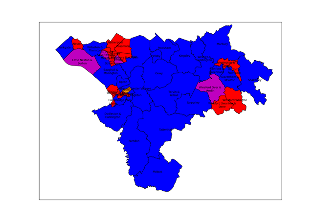
This post is about extracting the results from the local elections held on 5th May from the Cheshire West and Chester website and displaying them as a map. I could have manually transcribed the results from the website, this would probably be quicker, but where’s the fun in that?

The starting point for this exercise was noticing that the results pages have a little icon at the bottom saying “OpenElectionData”. This was part of an exercise to make local election results more easily machine-readable in order to build a database of results from across the country, somewhat surprisingly there is no public central record of local council election results. The technology used to provide machine access to the results is known as RDF (standing for Resource Description Framework), this is a way of providing “meaning” to web pages for machines to understand – this is related to the talk of the semantic web. The good folks at Southampton University have provided a browser which allows you to inspect the RDF contents of a webpage. I used this to get a human sight of the data I was trying to read.

RDF content ultimately amounts to triplets of information: “subject”,”predicate”,”object”. In the case of an election then one triplet has a subject of “specific ward identifier” the predicate is “a list of candidates” and the object is “candidate 1;candidate 2; candidate 3…”. Further triplets specify the whether a candidate was elected, how many votes they received and the party to which they belong.

I’ve taken to programming in Python recently, in particular using the Python(x,y) distribution which packages together an IDE with some libraries useful to scientists. This is the sort of thing I’d usually do with Matlab, but that costs (a lot) and I no longer have access to it at home.

There is a Python library for reading RDF data, called RDFlib, unfortunately most of the documentation is for version 2.4 and the working version which I downloaded is 3.0. Searching for documentation for the newer version normally leads to other sites where people are asking where the documentation is for version 3.0!

The base maps come from the Ordnance Survey, specifically the Boundary Line dataset which contains administrative boundary data for the UK in ESRI Shapefile format. This format is widely used for geographical information work, I found the PyShp library from GeospatialPython.com to be well-documented and straightforward way to read the format. The site also has some nice usage examples. I did look for a library to display the resulting maps but after a brief search I adapted the simple methods here for drawing maps using matlibplot.

The Ordnance Survey Open Data site is a treasure trove for programming cartophiles, along with maps of the UK of various types there’s a gazetteer of interesting places, topographic information and location data for UK postcode.

The map at the top of the page uses the traditional colour-coding of red for Labour and blue for Conservative, some wards elect multiple candidates and in those where the elected councillors are not all from the same party purple is used to show a Labour/Conservative combination and orange a Labour/Liberal Democrat combination.

In contrast to my earlier post on programming, the key elements here are the use of pre-existing libraries and data formats to achieve an end result. The RDF component of the exercise took quite a while, whilst the mapping part was the work of a couple of hours. This largely comes down to the quality of the documentation available. Python turns out to be a compact language to do this sort of work, it’s all done in 150 or so lines of code.

It would have been nice to have pointed my program to a single webpage and for it to find all the ward data from there, including the ward names, but I couldn’t work out how to do this – the program visits each ward in turn and I had to type in the ward names. The OpenElectionData site seemed to be a bit wobbly too, so I encoded party information into my program rather the pulling it from their site. Better fitting of the ward labels into the wards would have been nice too (although this is a hard problem). Obviously there’s a wide range of analysis that can be carried out on the underlying electoral data.

Footnotes

The python code to do this analysis is here. You will need to install the rdflib and PyShp libraries and download the OS Boundary Line data. I used the Python(x,y) distribution but I think it’s just the matlibplot library which is required. The CWac.py program extracts the results from the website and writes them to a CSV file, the Mapping.py program makes a map from them. You will need to adjust file paths to suit your installation.

Obsession

This is a short story about obsession: with a map, four books and some numbers.

My last blog post was on Ken Alder’s book “The Measure of All Things” on the surveying of the meridian across France, through Paris, in order to provide a definition for a new unit of measure, the metre, during the period of the French Revolution. Reading this book I noticed lots of place names being mentioned, and indeed the core of the whole process of surveying is turning up at places and measuring the angles to other places in a process of triangulation.

To me places imply maps, and whilst I was reading I popped a few of the places into Google Maps but this was unsatisfactory to me. Delambre and Mechain, the surveyors of the meridian, had been to many places. I wanted to see where they all were. Ken Alder has gone a little way towards this in providing a map: you can see it on his website but it’s an unsatisfying thing: very few of the places are named and you can’t zoom into it.

In my investigations for the last blog post, I discovered the full text of the report of the surveying mission, “Base du système métrique décimal”, was available online and flicking through it I found a table of all 115 triangles used in determining the meridian. So a plan is formed: enter the names of the stations forming the 115 triangles into a three column spreadsheet; determine the latitude and longitude of each of these stations using the Google Maps API; write these locations out into a KML file which can be viewed in Google Maps or Google Earth.

The problem is that place names are not unique and things have changed in the last 200 years. I have spent hours transcribing the tables and hunting down names of obscure places in rural France, hacking away with Python and loved every minute of it. Cassini’s earlier map of France is available online but the navigation is rather clumsy so I didn’t use it. Although now I come to writing this I see someone else has made a better job of it.

Beside three entries in the tables of triangles are the words: “Ce triangle est inutile” – “This triangle is useless”. Instantly I have a direct bond with Delambre, who wrote those words 200 years ago –  I know that feeling: in my loft is a sequence of about 20 lab books I used through my academic career and I know that besides an (unfortunately large) number of results the word “Bollocks!” is scrawled for very similar reasons.

The scheme with the the Google Maps API is that your program provides a place name “Chester, UK”, for example, and the API provides you with the latitude and longitude of the point requested. Sometimes this doesn’t work, either because there are several places with the same name or the placename is not in the database.

I did have a genuine Eureka moment: after several hours trying to find missing places on the map I had a bath and whilst there I had an idea: Google Earth supports overlay images on its maps. At the back of the “Base du système métrique décimal” there is a set of images showing where the stations are as a set of simple line diagrams. Surely I could overlay the images from Base onto Google Earth and find the missing stations? I didn’t leap straight from the bath, but I did stay up overlaying images onto maps deep into the night. It turns out the diagrams are not at all bad for finding missing stations. This manual fiddling to sort out errant stations is intellectually unsatisfying but some things it’s just quicker to do by hand!

You can see the results of my fiddling by loading this KML file into Google Earth, if you’re really keen this is a zip file containing the image overlays from “Base du système métrique décimal” – they match up pretty well given they are photocopies of diagrams subject to limitations in the original drawing and distortion by scanning.

What have I learned in this process?

  • I’ve learnt that although it’s possible to make dictionaries of dictionaries in Python it is not straightforward to pickle them.
  • I’ve enjoyed exploring the quiet corners of France on Google Maps
  • I’ve had a bit more practice using OneNote, Paint .Net, Python and Google Earth so when the next interesting thing comes along I’ll have a head start.
  • Handling French accents in Python is a bit beyond my wrangling skills.

You’ve hopefully learnt something of the immutable mind of a scientist!
View