Tag: data visualisation

Visualising the London Underground with Tableau

This post was first published at ScraperWiki.

I’ve always thought of the London Underground as a sort of teleportation system. You enter a portal in one place, and with relatively little effort appeared at a portal in another place. Although in Star Trek our heroes entered a special room and stood well-separated on platforms, rather than packing themselves into metal tubes.

I read Christian Wolmar’s book, The Subterranean Railway about the history of the London Underground a while ago. At the time I wished for a visualisation for the growth of the network since the text description was a bit confusing. Fast forward a few months, and I find myself repeatedly in London wondering at the horror of the rush hour underground. How do I avoid being forced into some sort of human compression experiment?

Both of these questions can be answered with a little judicious visualisation!

First up, the history question. It turns out that other obsessives have already made a table containing a list of the opening dates for the London Underground. You can find it here, on wikipedia. These sortable tables are a little tricky to scrape, they can be copy-pasted into Excel but random blank rows appear. And the data used to control the sorting of the columns did confuse our Table Xtract tool, until I fixed it – just to solve my little problem! You can see the number of stations opened in each year in the chart below. It all started in 1863, electric trains were introduced in the very final years of the 19th century – leading to a burst of activity. Then things went quiet after the Second World War, when the car came to dominate transport.

Timeline2

Originally I had this chart coloured by underground line but this is rather misleading since the wikipedia table gives the line a station is currently on rather than the one it was originally built for. For example, Stanmore station opened in 1932 as part of the Metropolitan line, it was transferred to the Bakerloo line in 1939 and then to the Jubilee line in 1979. You can see the years in which lines opened here on wikipedia, where it becomes apparent that the name of an underground line is fluid.

So I have my station opening date data. How about station locations? Well, they too are available thanks to the work of folk at Openstreetmap, you can find that data here. Latitude-longitude coordinates are all very well but really we also need the connectivity, and what about Harry Beck’s iconic “circuit diagram” tube map? It turns out both of these issues can be addressed by digitizing station locations from the modern version of Beck’s map. I have to admit this was a slightly laborious process, I used ImageJ to manually extract coordinates.

I’ve shown the underground map coloured by the age of stations below.

Age map2

Deep reds for the oldest stations, on the Metropolitan and District lines built in the second half of the 19th century. Pale blue for middle aged stations, the Central line heading out to Epping and West Ruislip. And finally the most recent stations on the Jubilee line towards Canary Wharf and North Greenwich are a darker blue.

Next up is traffic, or how many people use the underground. The wikipedia page contains information on usage, in terms of millions of passengers per year in 2012 covering both entries and exits. I’ve shown this data below with traffic shown at individual stations by the thickness of the line.

Traffic

I rather like a “fat lines” presentation of the number of people using a station, the fatter the line at the station the more people going in and out. Of course some stations have multiple lines so get an unfair advantage. Correcting for this it turns out Canary Wharf is the busiest station on the underground, thankfully it’s built for it. Small above ground beneath it is a massive, cathedral-like space.

More data is available as a result of a Freedom of Information request (here) which gives data broken down by passenger action (boarding or alighting), underground line, direction of travel and time of day – broken down into fairly coarse chunks of the day. I use this data in the chart below to measure the “commuteriness” of each station. To do this I take the ratio of people boarding trains in the 7am-10am time slot with those boarding 4pm-7pm. For locations with lots of commuters, this will be a big number because lots of people get on the train to go to work in the morning but not many get on the train in the evening, that’s when everyone is getting off the train to go home.

CommuterRatios

By this measure the top five locations for “commuteriness” are:

  1. Pinner
  2. Ruislip Manor
  3. Elm Park
  4. Upminster Bridge
  5. Burnt Oak

It was difficult not to get sidetracked during this project, someone used the Freedom of Information Act to get the depths of all of the underground stations, so obviously I had to include that data too! The deepest underground station is Hampstead, in part because the station itself is at the top of a steep hill.

I’ve made all of this data into a Tableau visualisation which you can play with here. The interactive version shows you details of the stations as your cursor floats over them, allows you to select individual lines and change the data overlaid on the map including the depth and altitude data that.

Messier and messier

Regular readers with a good memory will recall I bought a telescope about 18 months ago. I bemoaned the fact that I bought it in late Spring, since it meant it got dark rather late. I will note here that astronomy is generally incompatible with a small child who might wake you up in the middle of the night, requiring attention and early nights.

Since then I’ve taken pictures of the sun, the moon, Jupiter, Saturn and as a side project I also took wide angle photos of the Milky Way and star trails (telescope not required). Each of these bought their own challenges, and awe. The sun because it’s surprisingly difficult to find the thing in you view finder with the serious filter required to stop you blinding yourself when you do find it. The moon because it’s just beautiful and fills the field of view, rippling through the “seeing” or thermal turbulence of the atmosphere. Jupiter because of it’s Galilean moons, first observed by Galileo in 1610. Saturn because of it’s tiny ears, I saw Saturn on my first night of proper viewing. As the tiny image of Saturn floated across my field of view I was hopping up and down with excitement like a child.

I’ve had a bit of a hiatus in the astrophotography over the past year but I’m ready to get back into it.

My next targets for astrophotography are the Deep Sky Objects (DSOs), these are largish faint things as opposed to planets which are smallish bright things. My accidental wide-angle photos clued me into the possibilities here. I’d been trying to photograph constellations, which turn out to be a bit dull, at the end of the session I put the sensitivity of my camera right up and increased the exposure time and suddenly the Milky Way appeared! Even in rural Wales it was only just visible to the naked eye.

Now I’m keen to explore more of these faint objects. The place to start is the Messier Catolog of objects. This was compiled by Charles Messier and Pierre Méchain in the latter half of the 18th century. You may recognise the name Méchain, he was one of the two French men who surveyed France on the cusp of the Revolution to define a value for the meter. Ken Alder’s book The Measure of All Things, describes their adventures.

Messier and Mechain weren’t interested in the deep sky objects, they were interested in comets and compiled the list in order not to be distracted from their studies by other non-comety objects. The list is comprised of star clusters, nebula and galaxies. I must admit to being a bit dismissive of star clusters. The Messier list is by no means exhaustive, observations were all made in France with a small telescope so there are no objects from the Southern skies. But they are ideal for amateur astronomers in the Northern hemisphere since the high tech, professional telescope of the 18th century is matched by the consumer telescope of the 21st.

I’ve know of the Messier objects since I was a child but I have no intuition as to where they are, how bright and how big they are. So to get me started I found some numbers and made some plots.

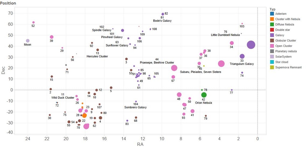
The first plot shows where the objects are in the sky. They are labelled, somewhat fitfully with their Messier number and common name. Their locations are shown by declination, how far away from the celestial equator an object is, towards the North Pole and right ascension, how far around it is along a line of celestial latitude. I’ve added the moon to the plot in a fixed position close to the top left. As you can see the majority of the objects are North of the celestial equator. The size of the symbols indicates the relative size of the objects. The moon is shown to the same scale and we can see that a number of the objects are larger than the moon, these are often star clusters but galaxies such as Andromeda – the big purple blob on the right and the Triangulum Galaxy are also bigger than the moon. As is the Orion nebula.

Position

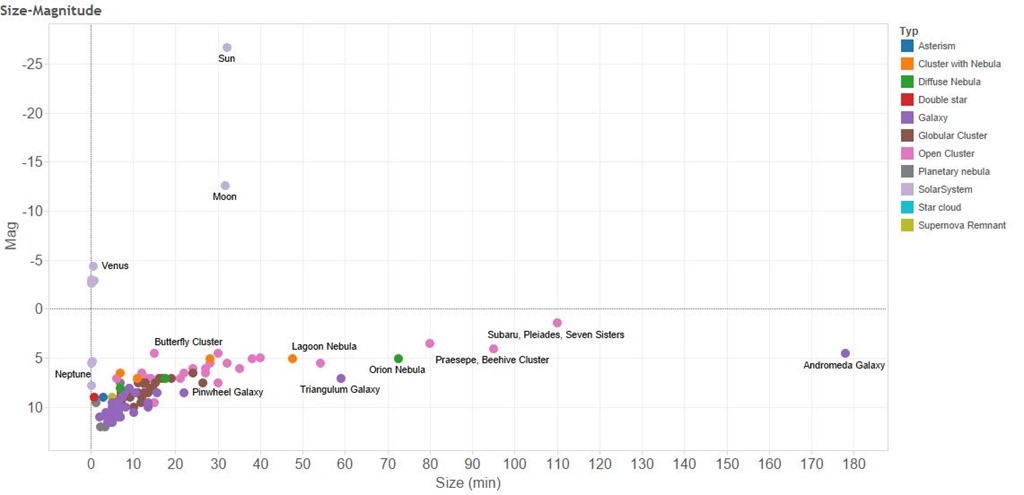
So why aren’t we as familiar with these objects as we are with the moon. The second plot shows how bright the Messier objects are and their size. The horizontal axis shows their apparent size – it’s a linear scale so that an object twice as far from the vertical axis is twice as big. Note that these are apparent sizes, some things appear larger than others because they are closer. The Messier The vertical axis shows the apparent brightness, in astronomy brightness is measured in units of “magnitude” which is a logarithmic scale. This means that although the sun is roughly magnitude –26 and the moon is roughly magnitude –13, the sun is 10,000 times bright than the moon. The Messier objects are all much dimmer than Venus, Jupiter and Mercury and generally dimmer than Saturn.

Size-Magnitude


So the Messier objects are often bigger but dimmer than things I have already photographed. But wait, the moon fills the field of view of my telescope. And not only that my telescope has an aperture of f/10 – a measure of it’s light gathering power. This is actually rather “slow” for a camera lens, my “fastest” lens is f/1.4 which represents a 50 fold larger light gathering power.

For these two reasons I have ordered a new lens for my camera, a Samyang 500mm f/6.3 this is going to give me a bigger field of view than my telescope which has a focal length of 1250mm. And also more light gathering power – my new lens should have more than double the light gathering power!

Watch this space for the results of my new purchase!

The BIG Lottery Data

uklogo

This post was originally published at ScraperWiki.

The UK’s BIG Lottery Fund recently released its grant data since 2004 as a set of lovely CSV files: You can get it yourself here or here. I found it a great opportunity to try out some new tricks with Tableau, and have a bit of a poke around another largish dataset from government. The data runs to a little under 120,000 lines.

The first question to ask is: where is all the money going?

The total awarded is £5,277,058,180 over nearly 10 years. It’s going to 81,386 different organisations. The sizes of grants vary enormously; the biggest, £214,340,846, going to the Big Local Trust, which is an umbrella organisation. Other big recipients include the Royal Society of Wildlife Trusts, who received £59,842,400 for the Local Food programme. The top 10 grants are listed below:

01/03/2012, Big Local Trust  £        214,340,846
15/08/2007, Royal Society of Wildlife Trusts  £          59,842,400
04/10/2007, The Federation of Groundwork Trusts  £          58,306,400
13/05/2008, Sustrans Limited  £          49,980,908
11/10/2012, Life Changes (Trustee) Limited  £          49,338,186
13/12/2011, Forces In Mind Trustee Limited  £          34,808,423
19/10/2007, Natural England  £          30,113,200
01/05/2007, Legacy Trust UK Limited  £          28,850,000
31/07/2007, Sustrans Limited  £          25,023,084
09/04/2008, Falkirk Council  £          25,000,000

Awards like this make determining the true geographic distribution of grants a bit tricky, since they are registered as being awarded to a particular local area – apparently the head office of the applicant – but they are used nationally. There is a regional breakdown of where the money is spent but this classification is to large areas i.e. “England” or “North West”. The Big Local Trust, Life Changes and Forces in Mind are all very recently established – less than a couple of years old. The Legacy Trust was established in 2007 to fund programmes to promote an Olympic legacy.

These are really big grants, but what does the overall distribution of awards look like?

This is shown in the chart below:

Award distribution

It’s a bit complicated because the spread of award sizes is from about £1000 to over £100,000,000 so what I’ve done is taken the logarithm of the award to create the bins. This means that the column marked “3” contains the sum of all awards from £1000 to £9999 and that marked “4” contains the sum of all awards from £10,000 to £99,999. The chart shows that most money is distributed in the column marked “5”, i.e. £100,000 to £999,999. The columns are coloured by the year in which money was awarded, so we can see that there were large grants awarded in 2007 as well as 2011 and 2013.

Everybody loves a word cloud, even though we know it’s not good in terms of data visualisation, a simple bar chart shows the relative frequency of words more clearly. The word cloud below shows the frequency of words appearing in the applicant name field of the data, lots of money going to Communities, Schools, Clubs and councils.

image

The data also include the founding date for the organisations to which money is awarded, most of them were founded since the beginning of the 20th century. There are quite a few schools and local councils in the list and, particularly for councils we can see the effect of legislation on the foundation of these organisations, there are big peaks in founding dates for councils in 1894 and in 1972-1974, coinciding with a couple of local government acts. There’s a dip in the foundation of bodies funded by the BIG lottery for both the First and Second World Wars, I guess people’s energies were directed elsewhere. The National Lottery started in the UK in late 1994.

Founding year

As a final piece of analysis I thought I’d look at sport; I’m not particularly interested in sport so I let natural language processing find sports for me in applicant names – they are often of the form “Somewhere Cricket/Rugby/Tennis/etc Club”. One way of picking out all the sports awards would be to come up with a list of sports names and compare against that list but I applied a little more cunning: the nltk library will tell you how closely related two words are using the WordNet lexicon which it contains. So I identified sports by measuring how closely related a target word was from the word “sport”. This got off to a shaky start  since I decided to use “cricket” as a test word; “cricket” is as closely related to “sport” as “hamster” – a puzzling result until I realised that the first definition of “cricket” in WordNet relates to the insect! This confusion dispensed with finding all the sports mentioned in the applicant names was an easy task. The list of sports I ended up with was unexceptional.

You can find participation levels in various sports here, I plotted them together with numbers of awards. Sports near the top left have relatively few awards given the number of participants, whilst those bottom right have more awards than would be expected from the number of participants.


Number of clubs vs number of participants

You can see interactive versions of these plots, plus a view more here on Tableau Public.

That’s what I found in the data – what would interest you?

Footnotes

I uploaded the CSV files to a MySQL database before loading into Tableau, I also did a bit of work in Python using the pandas library. In addition to the BIG lottery data I pulled in census data from the ONS and geographic boundary data from Tableau Mapping. You can see all this unfolding on the bitbucket repo I set up to store the analysis. Since Tableau workbook files are XML format they can be usefully stored in source control.

Book review: Tableau 8 – the official guide by George Peck

tableau 8 guideThis review was first published at ScraperWiki.

A while back I reviewed Larry Keller’s book The Tableau 8.0 Training Manual, at the same time I ordered George Peck’s book Tableau 8: the official guide. It’s just arrived. The book comes with a DVD containing bonus videos featuring George Peck’s warm, friendly tones and example workbooks. I must admit to being mildly nonplussed at receiving optical media, my ultrabook lacking an appropriate drive, but I dug out the USB optical drive to load them up. Providing an online link would have allowed the inclusion of up to date material, perhaps covering the version 8.1 announcement.

Tableau is a data visualisation application, aimed at the business intelligence area and optimised to look at database shaped data. I’m using Tableau on a lot of the larger datasets we get at ScraperWiki for sense checking and analysis.

Colleagues have noted that analysis in Tableau looks like me randomly poking buttons in the interface. From Peck’s book I learn that the order in which I carry out random clicking is important since Tableau will make a decision on what you want to see based both on what you have clicked and also its current state.

To my mind the heavy reliance on the graphical interface is one of the drawbacks of Tableau, but clearly, to business intelligence users and journalists, it’s the program’s greatest benefit. It’s a drawback because capturing what you’ve done in a GUI is tricky. Some of the scripting/version control capability is retained since most Tableau files are in plain XML format with which a little fiddling is tacitly approved by Tableau – although you won’t find such info in The Official Guide. I’ve been experimenting with using git source control on workbook files, and it works.

If you’re interested in these more advanced techniques then the Tableau Knowledgebase is worth a look. See this article, for example, on making a custom colour palette. I also like the Information Lab blog, 5 things I wish I knew about Tableau when I started and UK Area Polygon Mapping in TableauThe second post covers one of the bug-bears for non-US users of Tableau: the mapping functionality is quite US-centric.

Peck covers most of the functionality of Tableau, including data connections, making visualisations, a detailed look at mapping, dashboards and so forth. I was somewhat bemused to see the scatter plot described as “esoteric”. This highlights the background of those typically using Tableau: business people not physical scientists, and not necessarily business people who understand database query languages. Hence the heavy reliance on a graphical user interface.

I particularly liked the chapters on data connections which also described the various set, group and combine operations. Finally I understand the difference between data blending and data joining: joining is done at source between tables on the same database whilst blending is done on data from different sources by Tableau, after it has been loaded. The end result is not really different.

I now understand the point of table calculations – they’re for the times when you can’t work out your SQL query. Peck uses different language from Tableau in describing table calculations. He uses “direction” to refer to the order in which cells are processed and “scope” to refer to the groups over which cell calculations are performed. Tableau uses the terms “addressing” and “partitioning” for these two concepts, respectively.

Peck isn’t very explicit about the deep connections between SQL and Tableau but makes sufficient mention of the underlying processes to be useful.

It was nice to see a brief, clear description of the options for publishing Tableau workbooks. Public is handy and free if you want to publish to all. Tableau Online presents a useful halfway house for internal publication whilst Tableau Server gives full flexibility in scheduling updates to data and publishing to a range of audiences with different permission levels. This is something we’re interested in at ScraperWiki.

The book ends with an Appendix of functions available for field calculations.

In some ways Larry Keller and George Peck’s books complement each other, Larry’s book (which I reviewed here) contains the examples that George’s lacks and George’s some of the more in depth discussion missing from Larry’s book.

Overall: a nicely produced book with high production values, good but not encyclopedic coverage.

Book review: The Tableau 8.0 Training Manual – From clutter to clarity by Larry Keller

Tableau 8.0 Training Manual

This review was first published at ScraperWiki.

My unstoppable reading continues, this time I’ve polished off The Tableau 8.0 Training Manual: From Clutter to Clarity by Larry Keller. This post is part review of the book, and part review of Tableau.

Tableau is a data visualisation application which grew out of academic research on visualising databases. I’ve used Tableau Public a little bit in the past. Tableau Public is a free version of Tableau which only supports public data i.e. great for playing around with but not so good for commercial work. Tableau is an important tool in the business intelligence area, useful for getting a quick view on data in databases and something our customers use, so we are interested in providing Tableau integration with the ScraperWiki platform.

The user interface for Tableau is moderately complex, hence my desire for a little directed learning. Tableau has a pretty good set of training videos and help pages online but this is no good to me since I do a lot of my reading on my commute where internet connectivity is poor.

Tableau is rather different to the plotting packages I’m used to using for data analysis. This comes back to the types of data I’m familiar with. As someone with a background in physical sciences I’m used to dealing with data which comprises a couple of vectors of continuous variables. So for example, if I’m doing spectroscopy then I’d expect to get a pair of vectors: the wavelength of light and the measured intensity of light at those wavelengths. Things do get more complicated than this, if I were doing a scattering experiment then I’d get an intensity and a direction (or possibly two directions). However, fundamentally the data is relatively straightforward.

Tableau is crafted to look at mixtures of continuous and categorical data, stored in a database table. Tableau comes with some sample datasets, one of which is sales data from superstores across the US which illustrates this well. This dataset has line entries of individual items sold with sale location data, product and customer (categorical) data alongside cost and profit (continuous) data. It is possible to plot continuous data but it isn’t Tableau’s forte.

Tableau expects data to be delivered in “clean” form, where “clean” means that spreadsheets and separated value files must be presented with a single header line with columns which contain data all of the same type. Tableau will also connect directly to a variety of databases. Tableau uses the Microsoft JET database engine to store it’s data, I know this because for some data unsightly wrangling is required to load data in the correct format. Once data is loaded Tableau’s performance is pretty good, I’ve been playing with the MOT data which is 50,000,000 or so lines, which for the range of operations I tried turned out to be fairly painless.

Turning to Larry Keller’s book, The Tableau 8.0 Training Manual: From Clutter to Clarity, this is one of few books currently available relating to the 8.0 release of Tableau. As described in the title it is a training manual, based on the courses that Larry delivers. The presentation is straightforward and unrelenting; during the course of the book you build 8 Tableau workbooks, in small, explicitly described steps. I worked through these in about 12 hours of screen time, and at the end of it I feel rather more comfortable using Tableau, if not expert. The coverage of Tableau’s functionality seems to be good, if not deep – that’s to say that as I look around the Tableau interface now I can at least say “I remember being here before”.

Some of the Tableau functionality I find a bit odd, for example I’m used to seeing box plots generated using R, or similar statistical package. From Clutter to Clarity shows how to make “box plots” but they look completely different. Similarly, I have a view as to what a heat map looks like and the Tableau implementation is not what I was expecting.

Personally I would have preferred a bit more explanation as to what I was doing. In common with Andy Kirk’s book on data visualisation I can see this book supplementing the presented course nicely, with the trainer providing some of the “why”. The book comes with some sample workbooks, available on request – apparently directly from the author whose email response time is uncannily quick.