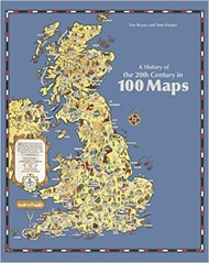
 A History of the 20th Century in 100 Maps by Tim Bryars and Tom Harper is similar in spirit to The Information Capital by James Cheshire and Oliver Uberti: a coffee table book pairing largely geographic visualisations with relatively brief text. Looking back I see that The Information Capital was a birthday present from Mrs SomeBeans, 100 Maps was a Christmas present from the same!
The book is published by the British Library. The maps are wide ranging in scale, scope and origin. Ordnance Survey maps of the trenches around the Battle of the Somme nestle against tourist maps of the Yorkshire coast, and tourist maps of Second World War Paris for the Nazi occupiers. The military maps are based on the detailed work by organisations like the Ordnance Survey whilst other maps are cartoons of varying degrees of refinement, “crude” being particularly relevant in the case of he Viz map of Europe!
War and tourism are recurring themes of the book. In war maps are used to plan a battle, conduct a post mortem and as propaganda. It is not uncommon to see newspaper cartoon style maps with countries represented by animals, or breeds of dog. In tourism maps are used as marketing – the presentation and “incidental” details at least as important as the navigation. Sometimes the “tourism” relates to state events. Not quite fitting into either war or tourism is the crudest map in the book, a sketch of Antarctica on the back of a menu card, made by Shackleton as he tried to persuade his neighbour at a formal dinner to help fund his expedition.
A third category is the economic map showing, for example the distribution of new factories around the UK in the post-war period or the exploitation of oil in the Caribbean or the North Sea. This maps were published sometimes for education, and sometimes as part of a prospectus for investment or a tool of persuasion.
The focus of the book is really on the history of Britain rather than maps, this is a useful bait-and-switch for people like me who are ardent followers of maps but not so much of history. It struck me the impact that the two world wars of the 20th century had on UK. Not simply the effect of war itself but the rise of women in the workforce, and independence movements in the now former colonies, homes for heroes, nationalisation – the list goes on. It seems the appetite for all these things was generated during the First World War but they were not satisfied until after the Second. The First World War also saw the introduction of prohibitions on opium and cocaine, prior to this they were seen as the safe recreation of the upper middle classes during the war they were seen as a risk to the war effort. America had lead the way with the prohibition of drugs, and later alcohol, seeing them as a vice of immigrants and working classes.
I didn’t realise there were no controls on immigration to the UK until the 1905 Alien Act, this nugget is found in a commentary on a map entitled “Jewish East London”. This map was based on Charles Booth’s social maps of London and published by the Toybnee Trust. The Jewish population had been increasing over the preceding 25 years following pogroms and anti-Semitic violence in the Russian Empire. The Trust published the map alongside articles for and against immigration controls but, as the authors point out, the map is designed with its use of colouring and legends to make the case against.
100 maps is not all about the real world, E.H. Shepard’s map of the Hundred Acre Wood makes it in, as well Tolkien’s map of Middle Earth. In both cases the map provides an overview of the story inside. I rather like the map of Hundred Acre Wood map with “Eeyores Gloomy Place – rather boggy and sad”, and a compass rose which spells out P-O-O-H.
The book is well-made and presented but in these times of zoomable online maps physical media struggle to keep up. The maps are difficult to study in detail at the A4 size in which they are presented. 100 maps makes some comment on the technical evolution of maps, not so much in the collection of data, but in the printing and presentation process. It is only in the final decades of the century that full colour printed maps become commonplace. It is around 1990 that the Ordnance Survey becomes fully digital in its data collection.
All in all a fine present – thank you Mrs SomeBeans!

