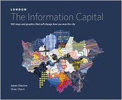
Today I review  The Information Capital by James Cheshire and Oliver Uberti – a birthday present. This is something of a coffee table book containing a range of visualisations pertaining to data about London. The book has a website where you can see what I’m talking about (here) and many of the visualisations can be found on James Cheshire’s mappinglondon.co.uk website.
This type of book is very much after my own heart, see for example my visualisation of the London Underground. The Information Capital isn’t just pretty, the text is sufficient to tell you what’s going on and find out more.
The book is divided into five broad themes “Where We Are”, “Who We Are”, “Where We Go”, “How We’re Doing” and “What We Like”. Inevitably the majority of the visualisations are variants on a coloured map but that’s no issue to my mind (I like maps!).
Aesthetically I liked the pointillist plots of the trees in Southwark, each tree gets a dot, coloured by species and the collection of points marks out the roads and green spaces of the borough. The twitter map of the city with the dots coloured by the country of origin of the tweeter is in similar style with a great horde evident around the heart of London in Soho.
The visualisations of commuting look like thistledown, white on a dark blue background, and as a bonus you can see all of southern England, not just London. You can see it on the website (here). A Voroni tessellation showing the capital divided up by the area of influence (or at least the distance to) different brands of supermarket is very striking. To the non-scientist this visualisation probably has a Cubist feel to it.
Some of the charts are a bit bewildering, for instance a tree diagram linking wards by the prevalent profession is confusing and the colouring doesn’t help. The mood of Londoners is shown using Chernoff faces, this is based on data from the ONS who have been asking questions on life satisfaction, purpose, happiness and anxiety since 2011. On first glance this chart is difficult to read but the legend clarifies for us to discover that people are stressed, anxious and unhappy in Islington but perky in Bromley. You can see this visualisation on the web site of the book (here).
The London Guilds as app icons is rather nice, there’s not a huge amount of data in the chart but I was intrigued to learn that guilds are still being created, the most recent being the Art Scholars created in February 2014. Similarly the protected views of London chart is simply a collection of water-colour vistas.
I have mixed feelings about London, it is packed with interesting things and has a long and rich history. There are even islands of tranquillity, I enjoyed glorious breakfasts on the terrace of Somerset House last summer and lunches in Lincoln’s Inn Fields. But I’ve no desire to live there. London sucks everything in from the rest of the country, government sits there and siting civic projects outside London seems a great and special effort for them. There is an assumption that you will come to London to serve. The inhabitants seem to live miserable lives with overpriced property and hideous commutes, these things are reflected in some of the visualisations in this book. My second London Underground visualisation measured the walking time between Tube station stops, mainly to help me avoid that hellish place at rush hour. There is a version of such a map in The Information Capital.
For those living outside London, The Information Capital is something we can think about implementing in our own area. For some charts this is quite feasible based, as they are, on government data which covers the nation such as the census or GP prescribing data. Visualisations based on social media are likely also doable although will lack weight of numbers. The visualisations harking back to classics such as John Snow’s cholera map or Charles Booth’s poverty maps of are more difficult since there is no comparison to be made in other parts of the country. And other regions of the UK don’t have Boris Bikes (or Boris, for that matter) or the Millennium Wheel.
It’s completely unsurprising to see Tufte credited in the end papers of The Information Capital. There are also some good references there for the history of London, places to get data and data visualisation.
I loved this book, its full of interesting and creative visualisations, an inspiration!

